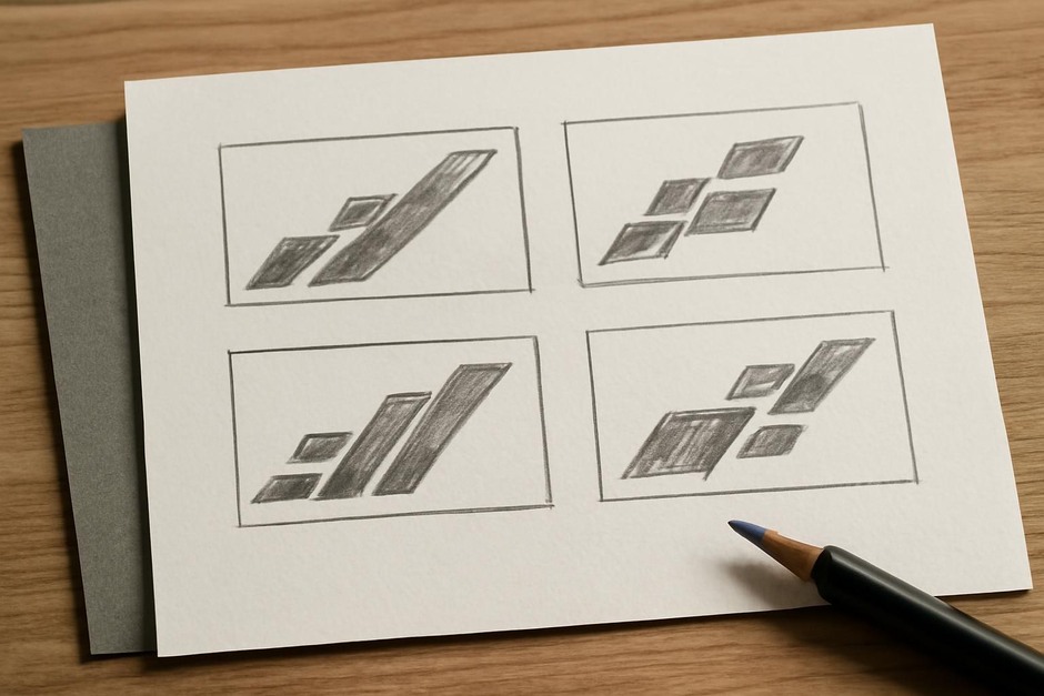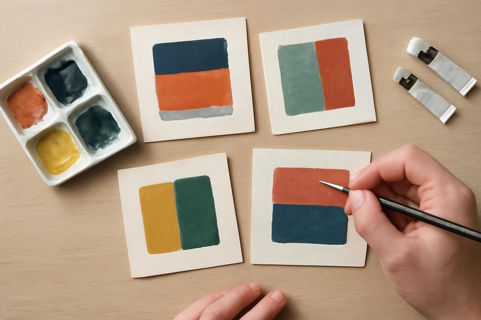
Limited Palette Thumbnails: Colour Choices at a Small Scale
Why limit the palette in thumbnails
Working with a restricted range of colours helps you see their structural role without the distraction of many hues. In a thumbnail, colour functions alongside value and shape to create emphasis. Two or three colours are enough to test relationships: which hue dominates, how temperature shifts affect balance, and whether a small coloured accent can serve as a focal point.
Simple two-colour drill
Pick two colours that contrast in temperature or saturation—warm vs cool, bright vs muted. Make four thumbnails:
- Majority colour A with small accents of B.
- Majority colour B with small accents of A.
- Equal areas of A and B.
- A neutral background with A and B as focal marks.
Concrete example: choose a muted blue and a warm orange. When blue dominates and orange is a small accent, the orange pops. Reverse the dominance to see how the orange becomes integrated and the blue reads as grounding. Equal areas create tension that may require value adjustments to settle.
Three-colour interaction
Add a neutral or desaturated third colour to act as a divider or rest area. This third colour can reduce visual friction and help the two stronger colours maintain clarity. Try arranging three thumbnails where the neutral occupies the background in varying amounts to see how much breathing room the composition needs.
Value over hue
Remember that value often dominates colour perception, especially at small scale. Convert your thumbnail to grayscale mentally: if a colour reads too similarly in value to its neighbour, it may fail as an accent. Adjusting saturation or adding a thin dark outline can recover separation.
Practical exercises
- Accent test: place a single small spot of a contrasting colour near the edge, center, and intersection of diagonals to test where it most effectively draws attention.
- Temperature counterpoint: use a cool dominant field and a warm counterpoint to see how warmth moves forward visually.
- Value swap: make a version where the same colours are present but one is darkened or lightened to test which configuration reads as clearer focal hierarchy.
These thumbnail routines help you learn how limited palettes behave in fast studies. Colour choices that work at thumbnail scale tend to scale up well because the basic relationships are already resolved. Use these tests to settle broad colour decisions before investing time in larger paintings or detailed illustrations.